The Redesign brings a completely refreshed user experience built around clarity, simplicity, and focus. As business processes evolve, so must the tools that support them—and this redesign reflects our commitment to helping you work more efficiently, with less friction. We've introduced a cleaner interface, consolidated navigation into a single side menu, and refined the layout to eliminate distractions. With streamlined menus, more intuitive section names, and a layout that adapts to your workflow, the new Xeelo makes it easier to stay focused, find what you need faster, and complete your tasks with confidence. This update is more than just a new look—it's the foundation for a smarter, more user-friendly Xeelo.
Fresh Look
Xeelo's new interface reflects today's best practices in design — clean,
consistent, and easy on the eyes. The redesign brings a fresh,
professional look that feels familiar and modern at the same time.
Better User Experience
The redesign puts the user first—making Xeelo easier to navigate,
more pleasant to use, and better aligned with real-world workflows.
Every visual and structural change was made with clarity, simplicity,
and efficiency in mind—so you can stay focused, confident, and in control.
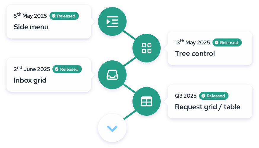
Roadmap
Latest Features
Request Grid
New layout – Cleaner structure, more space, and improved readability. Requests are now easier to navigate than ever.
Toolbar panel –Perform bulk actions in just a few clicks. All key tools are right at your fingertips.
Row actions –Change priority, update the workflow, or open a request in a new tab – all without leaving the overview.
Custom filters –Apply filters once, save them for later, or easily share them with your team.
The new view in the Inbox section introduces a more straightforward, faster,
and modern way to work with your tasks. Instead of the original tiles, object
types are now shown one below the other as collapsible blocks, making it easier
to navigate and focus on what matters. When expanded, each block reveals up to
10 requests currently assigned to you, with no need for additional clicking.
The redesign also brings a new All tab consolidating all your tasks across companies.
Inbox Grid streamlines your daily workflow, saves time, and helps you stay focused.
The redesigned tree control helps you stay focused with a cleaner layout, collapsible object types,
and simplified company switching. The active request counts are now easier to see, so you can navigate with more clarity and confidence.
Side Menu - The redesigned side menu brings all key navigation elements together in one place,
including dashboards, requests, and tasks. With clearer section names and a collapsible layout.
Application Header - The updated application header offers a cleaner, more focused experience and now includes an environment label.
This new tag clearly shows whether you're working in the Production, Test, or Development environment.